
PapaBook
2023
Editorial PapaBook
Spain
Identity
Logotype design
Custom Lettering
2023
Editorial PapaBook
Spain
Identity
Logotype design
Custom Lettering
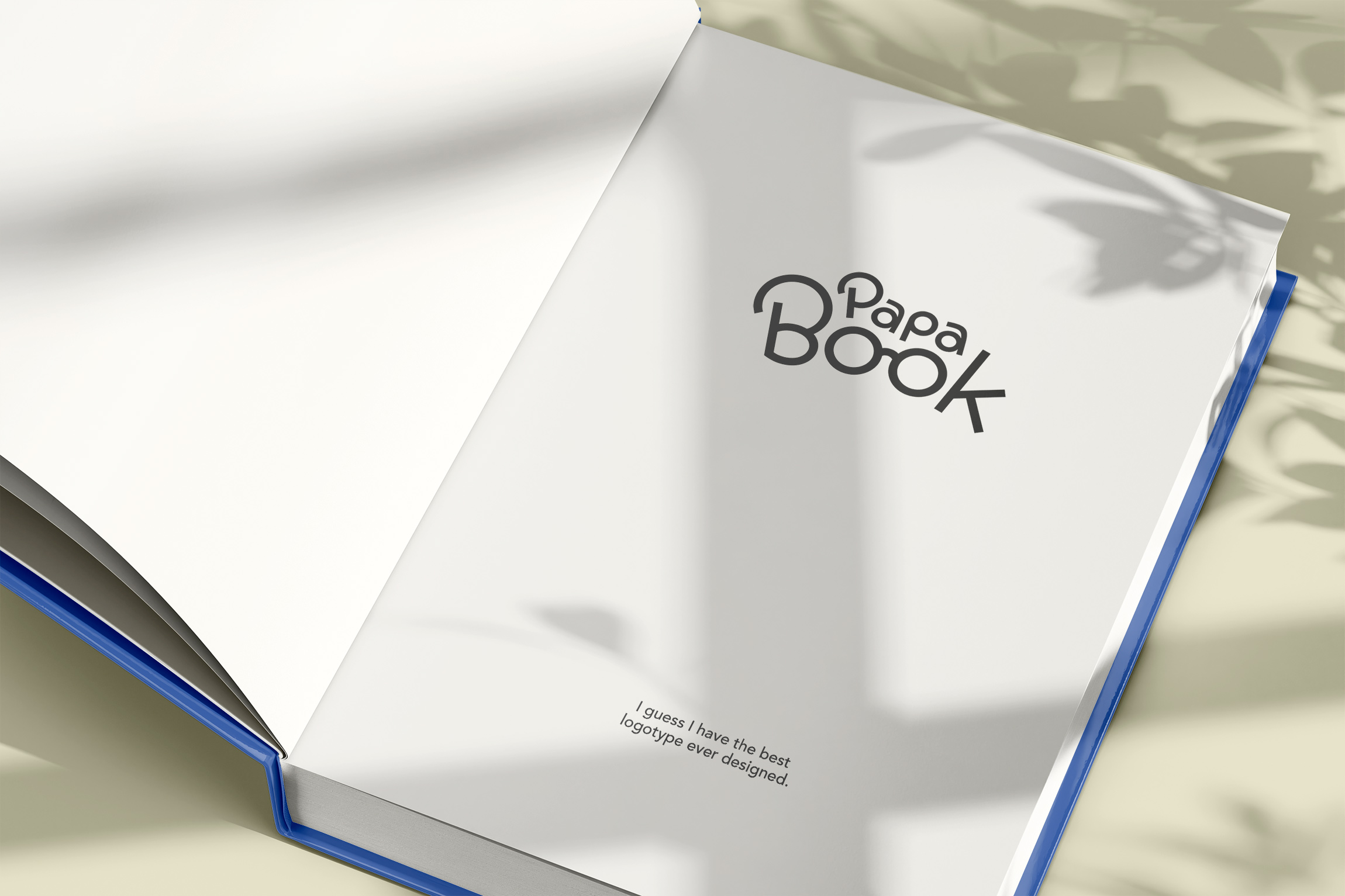
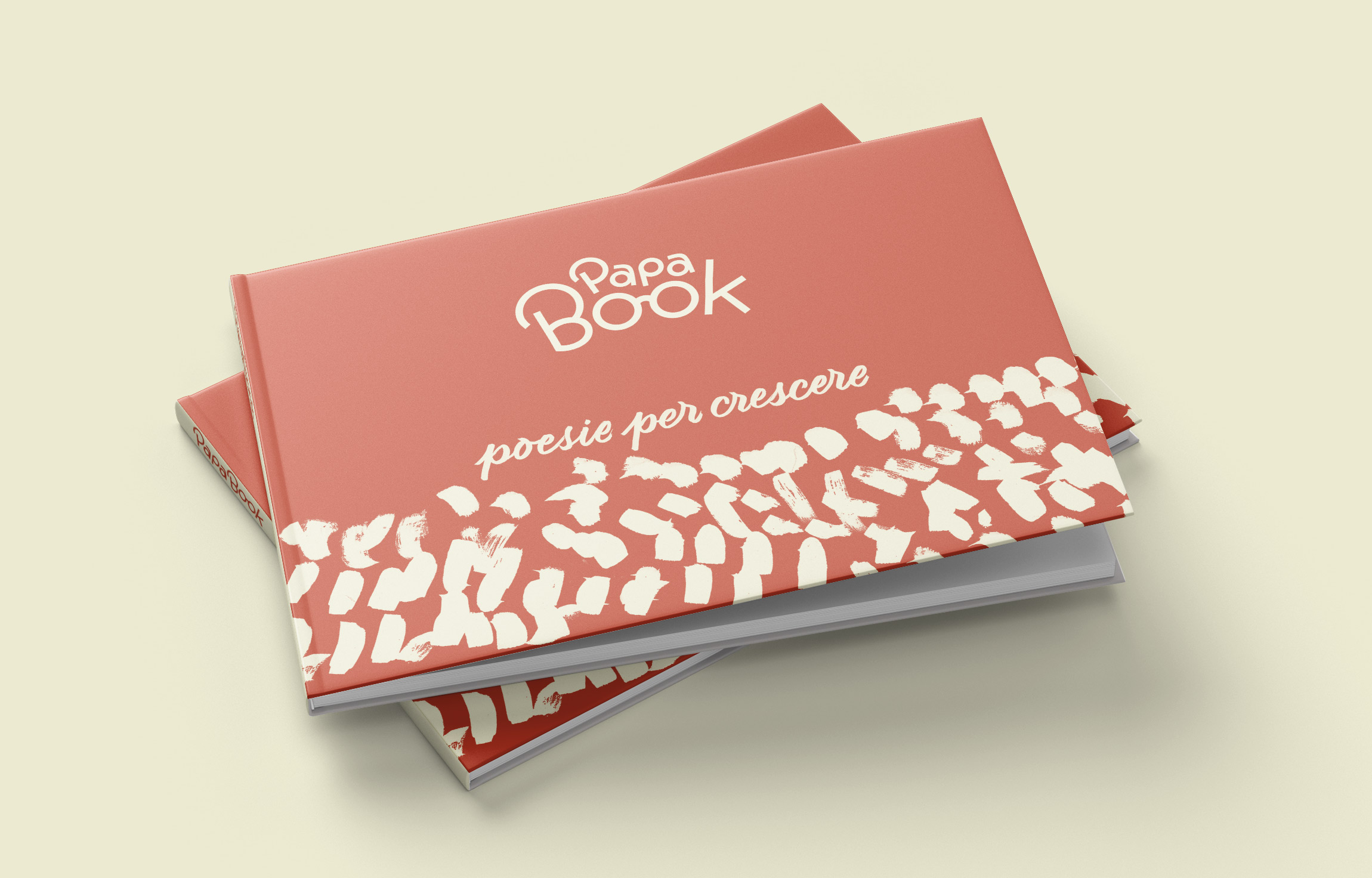
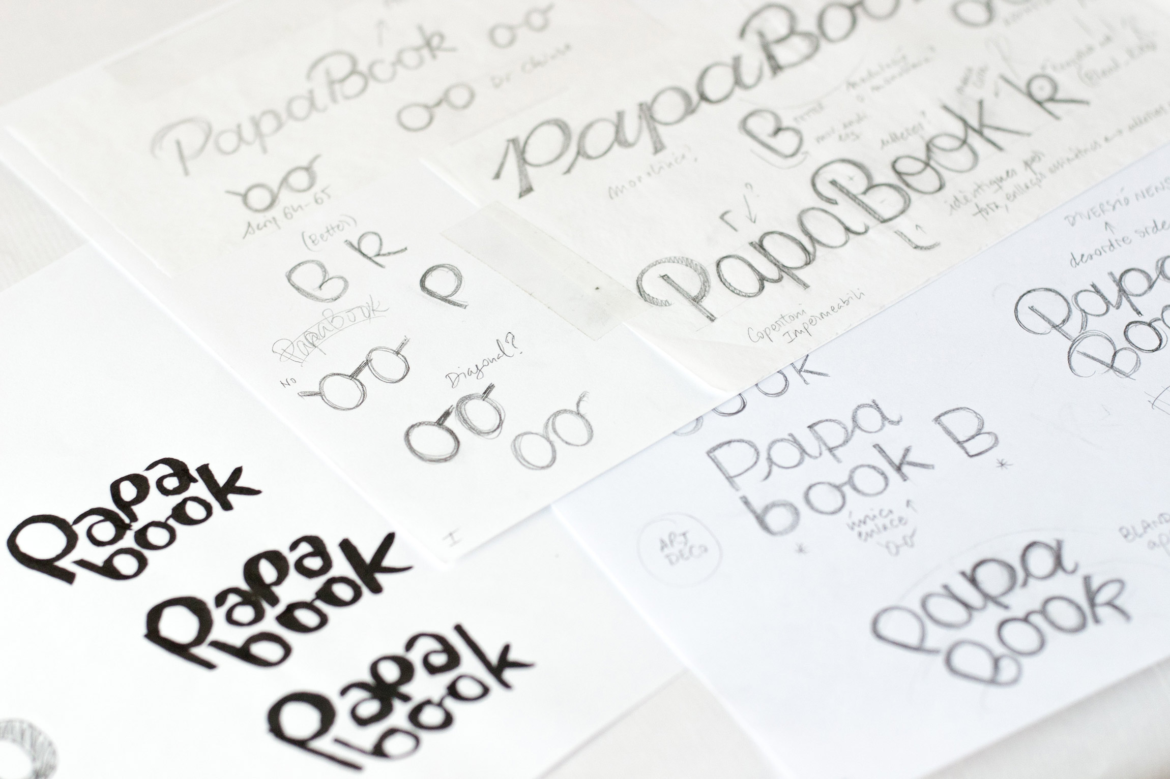
Custom Lettering logotype created for PapaBook, a brand new publishing house for children.
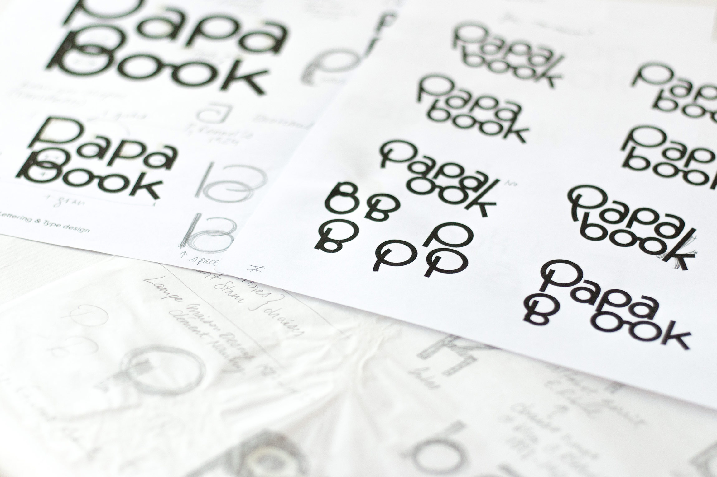
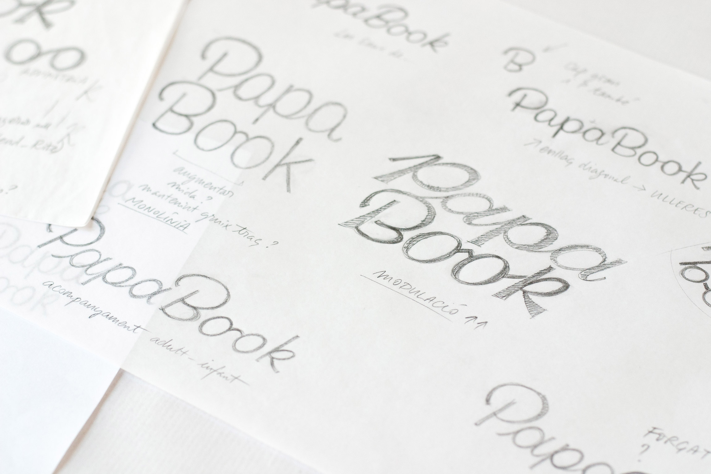
The client's single design constraint was to utilize standard glasses to represent the double ‘o’ ligature in ‘Book’. Consequently, the letterform research was anchored in the geometry and circularity of that central symbol, employing the circle, the straight line, and the diagonal line to build the entire identity system. Prioritizing curved forms and simplicity was essential for legibility among the young audience. We also ensured the letterforms blended softness and kindness to achieve a graceful yet friendly feel.
The client's single design constraint was to utilize standard glasses to represent the double ‘o’ ligature in ‘Book’. Consequently, the letterform research was anchored in the geometry and circularity of that central symbol, employing the circle, the straight line, and the diagonal line to build the entire identity system. Prioritizing curved forms and simplicity was essential for legibility among the young audience. We also ensured the letterforms blended softness and kindness to achieve a graceful yet friendly feel.
After extensive shape exploration, the brand now features two logo options. The primary logo’s structure is built around the central glasses, with the remaining logotype growing outwards from both sides and adopting a gentle curved structure. An alternative version is available for horizontal applications as needed.
The irregular baseline in both marks makes the brand welcoming, playful, and relatable. Ultimately, the goal is for the design to generate immediate sympathy with children at home.