Grandes Esperanzas
2019
Joyería Suárez
Spain
Identity
Logotype design
Custom Lettering
Product photography, video and graphic design applications: Joyería Suárez
2019
Joyería Suárez
Spain
Identity
Logotype design
Custom Lettering
Product photography, video and graphic design applications: Joyería Suárez
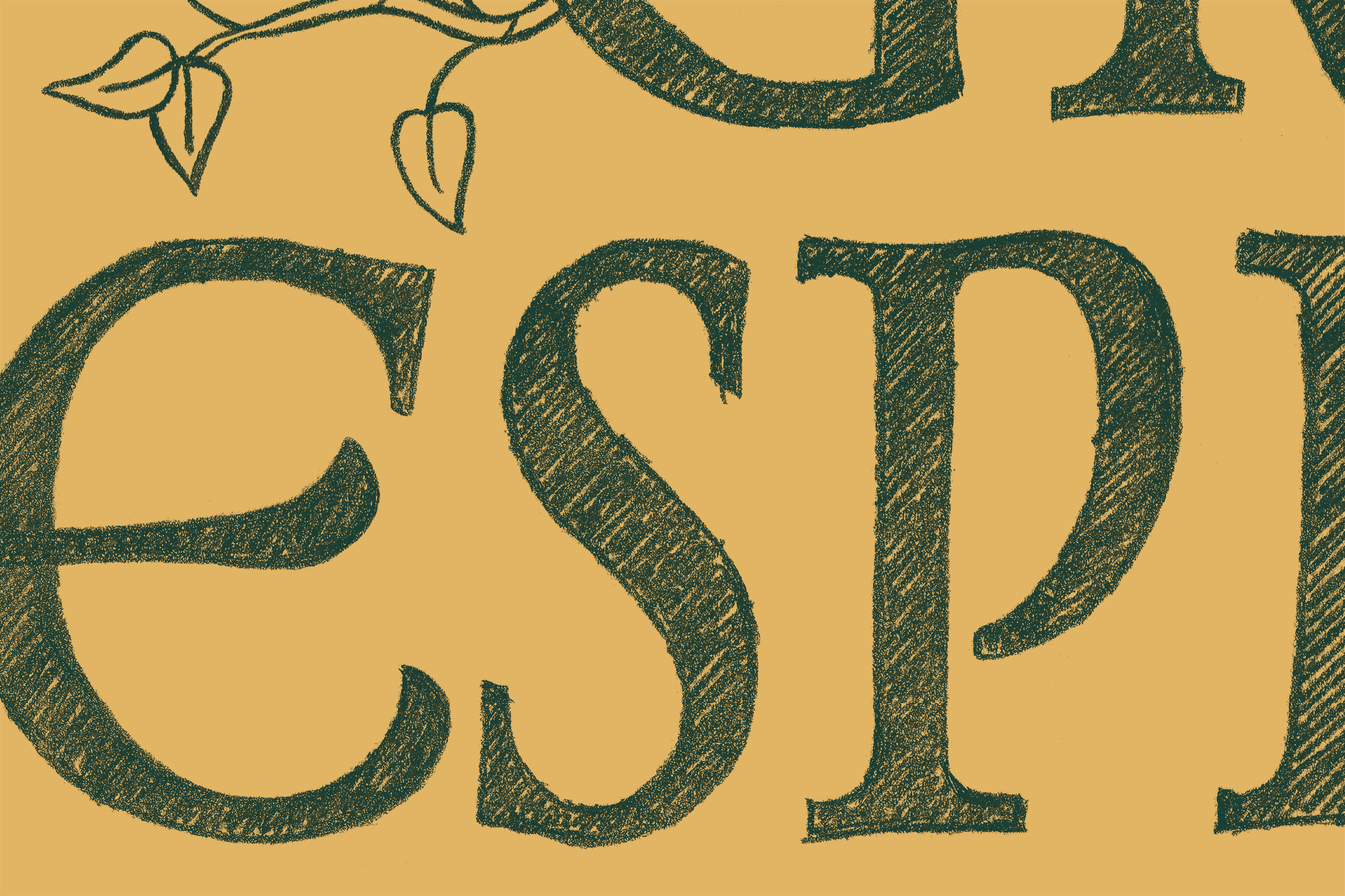
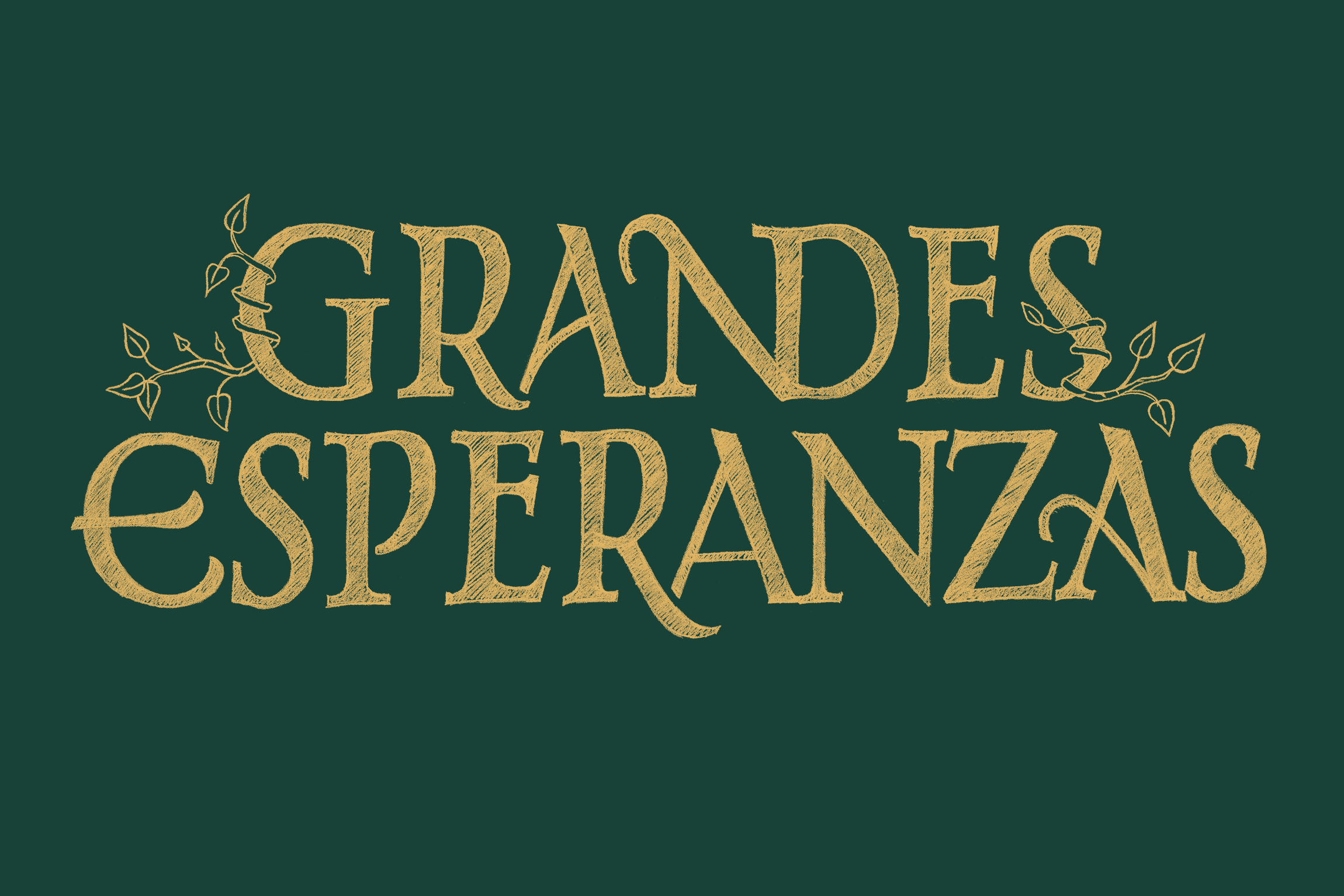
Custom Lettering design for the Joyería Suárez jewelry collection «Grandes Esperanzas», inspired by the homonymous film by Alfonso Cuarón. It was from some scenes of this movie that both the style and certain relationships between letterforms emerged. Specifically, the hand-drawn logotype is based on the Roman capital letters from the main gate entrance to the «Paradiso Perduto» garden. And to fit with the story and the essence of the collection, the logotype also includes some botanical elements.
At first, the organic touch was more evident in the drawing, as it was used to build some of the letterforms. Later on, it was reduced to very subtle complimentary details just to open and end the lettering composition. Anyway, several organic shapes still remain on the final lettering proposal to recall the collection's botanical leitmotif. The genuine raw finish of the pencil was kept even in the final version to reinforce the artisanal value of the whole collection, promoted with an illustrated book by Sara Herranz with the brand reinterpretation of Charles Dickens story.


