Girouette
2018
Personal project
TypeParis 2018
France
Type design
Custom Type
Typeface family
2018
Personal project
TypeParis 2018
France
Type design
Custom Type
Typeface family
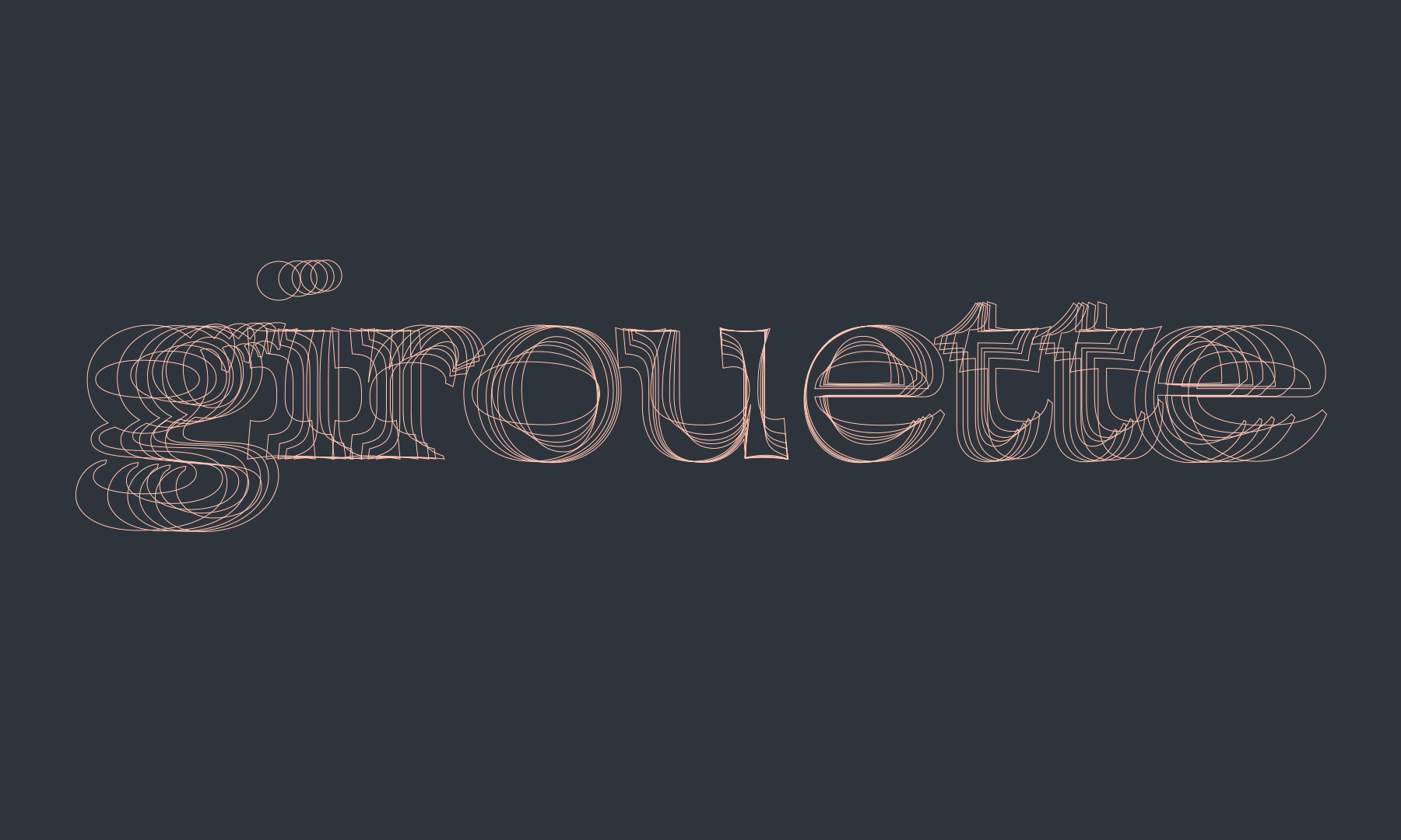
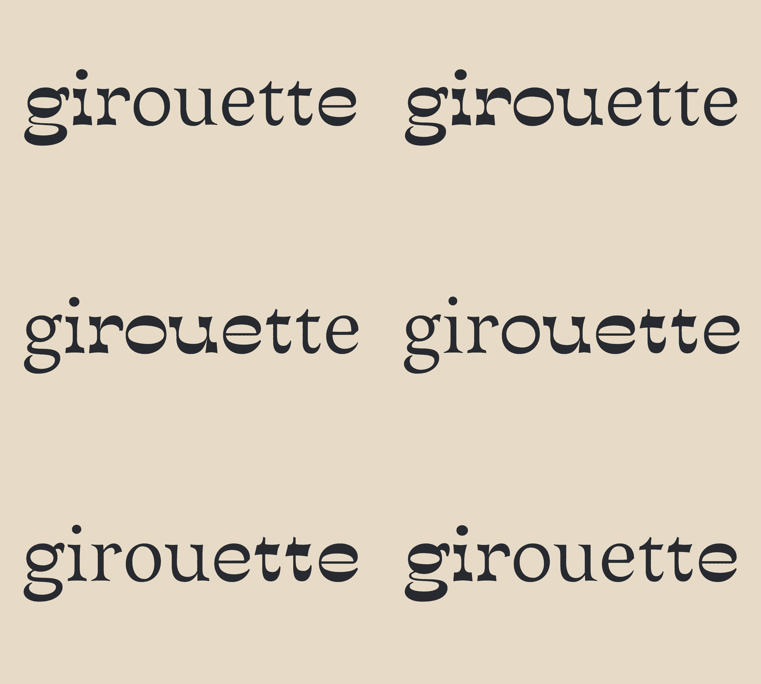
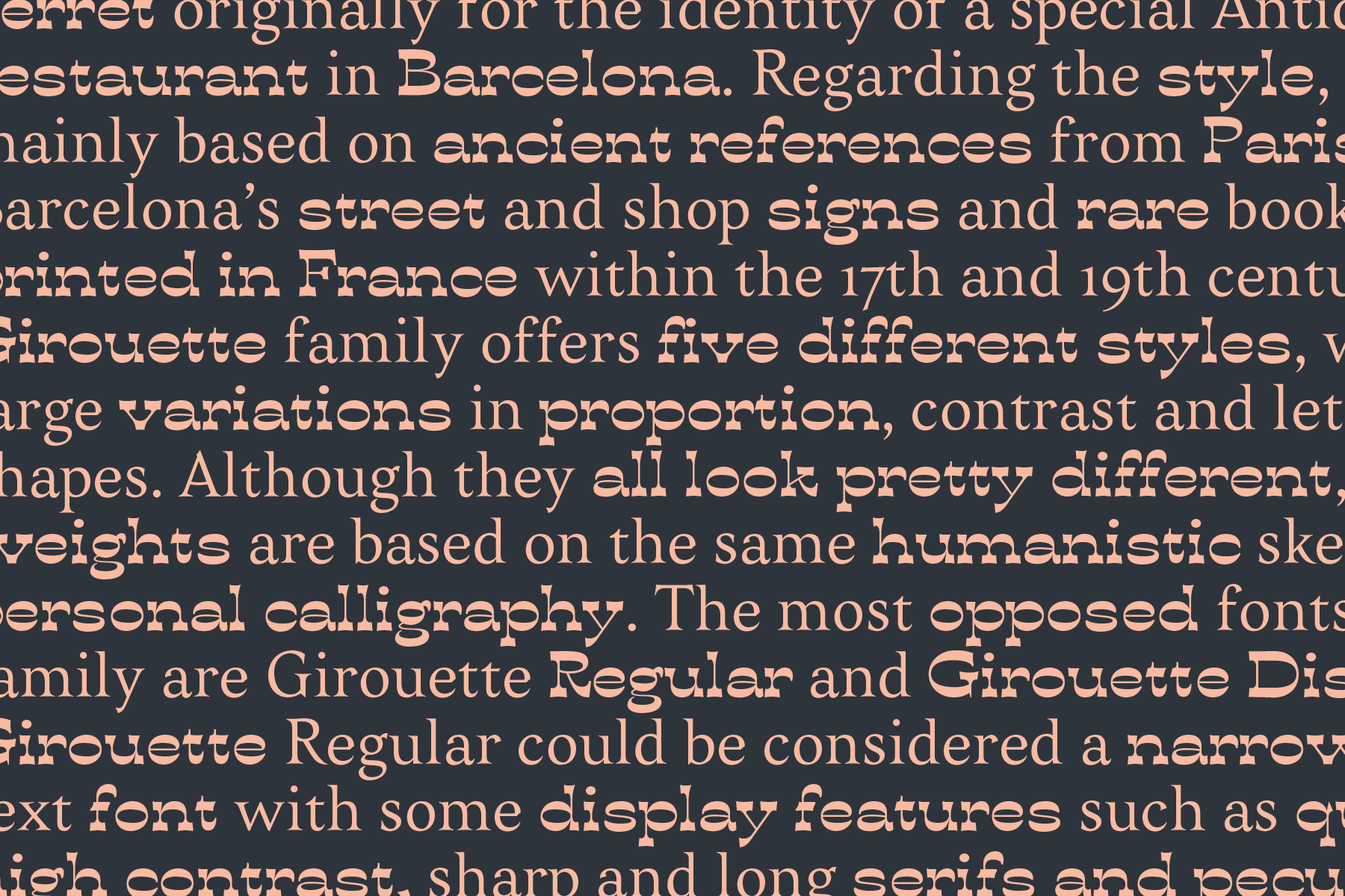
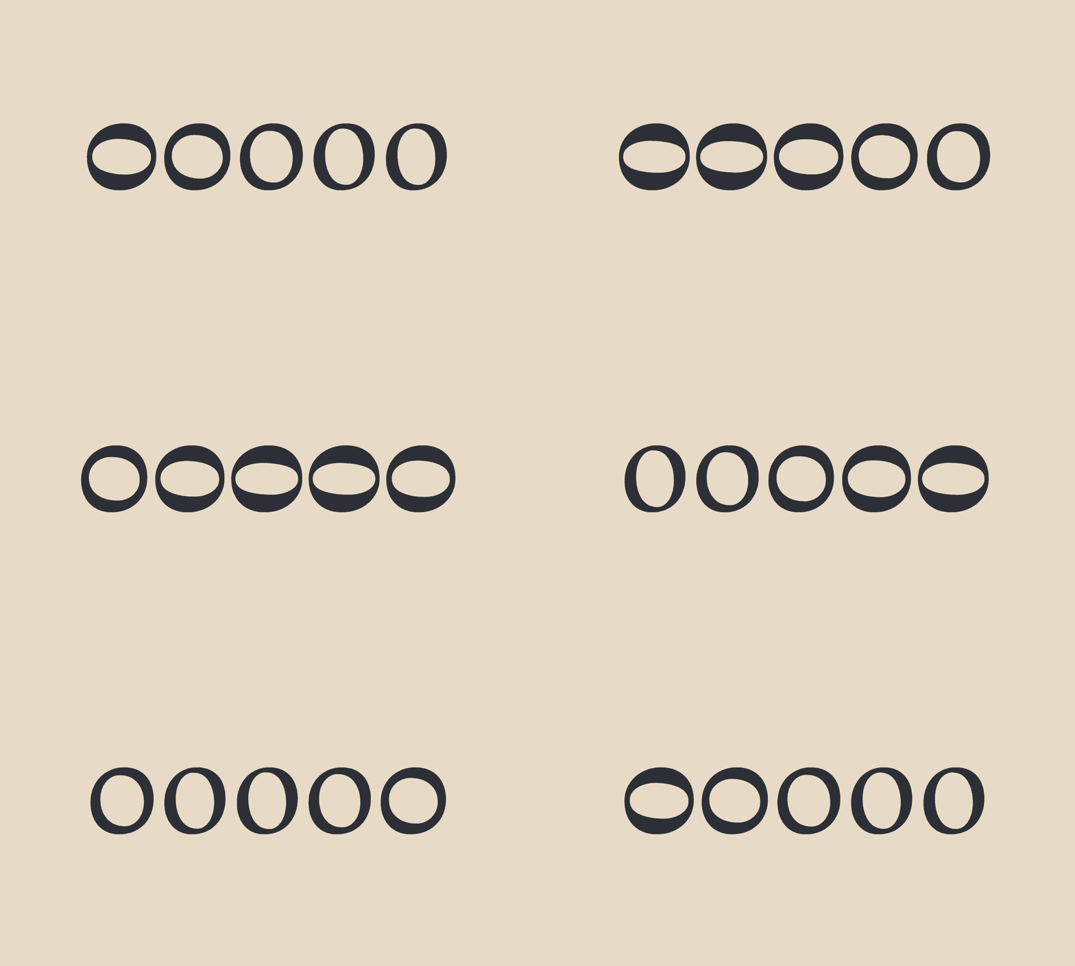
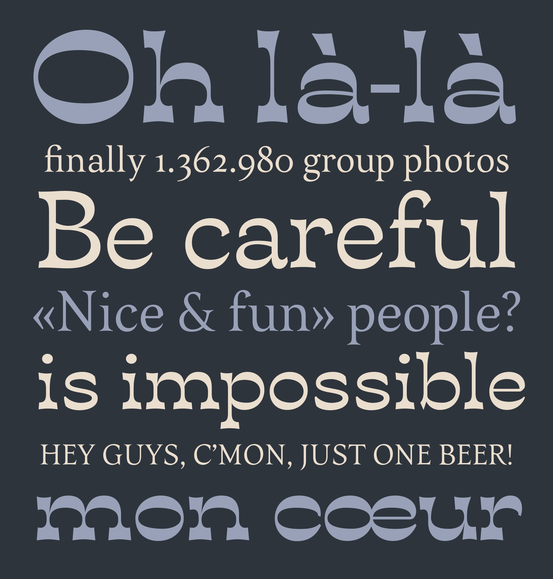
Girouette family offers five different styles, with notable variations in weight, proportion and contrast. Although they all look pretty different, all five weights are based on the same humanistic skeleton. The project was originally conceived for the identity of a very special Antiquarian-restaurant in Barcelona within TypeParis 2018 programme. Regarding the style, it's mainly based on ancient references from Paris & Barcelona street and shop signs and rare books printed in France within the 17th and 19th centuries.
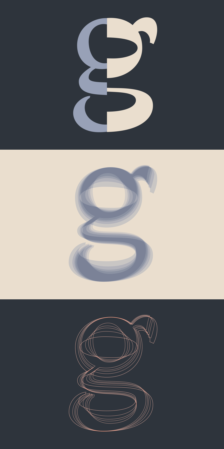
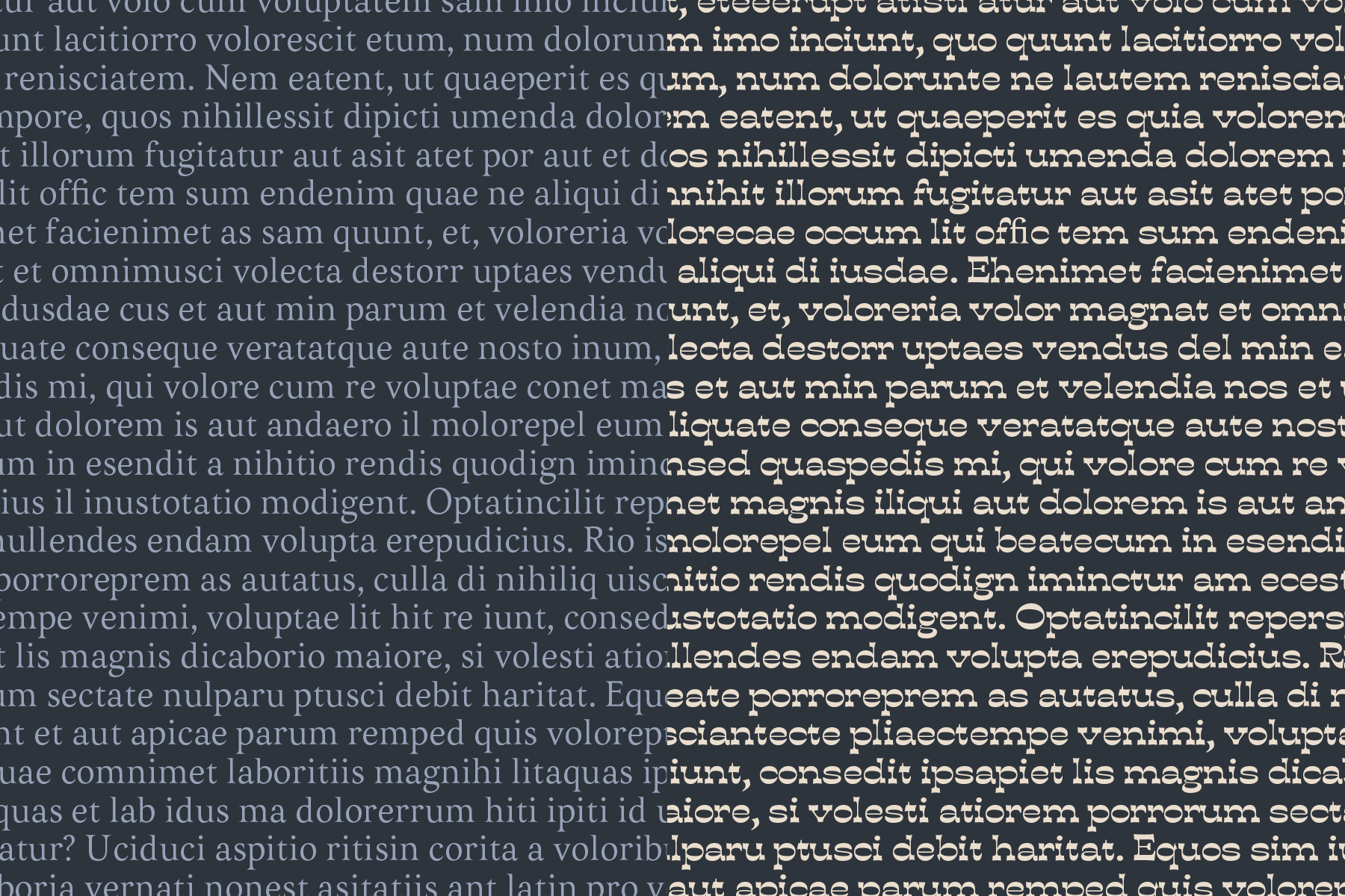
The most opposed fonts of the family are Girouette Regular and Girouette Black. Girouette Regular could be considered a narrow body text font with some display features such as quite high contrast, sharp and long serifs and peculiar endings in some letterforms.
The most opposed fonts of the family are Girouette Regular and Girouette Black. Girouette Regular could be considered a narrow body text font with some display features such as quite high contrast, sharp and long serifs and peculiar endings in some letterforms.
Following its historical references, it has also long ascendants and descendants. On the contrary, Girouette Black is a wide typeface for headers designed with reversed contrast. Interpolating these master fonts, three new styles came up: Girouette Medium, Girouette Demi-Bold and Girouette Bold. And curiously, characteristic high contrast of both main fonts almost disappears in the Demi-Bold weight.
Related to the Antiquarian-restaurant, whose products have completely disparate styles, ages and origins; Girouette typeface family finds the way to mix very unlike styles in a same design.
Related to the Antiquarian-restaurant, whose products have completely disparate styles, ages and origins; Girouette typeface family finds the way to mix very unlike styles in a same design.


External links about Girouette
1— Estudi Toni Bauzà designed the identity of Edicions delmediterrani, an independent publishing house, using Girouette type family.
2— Spanish blog on type Rayitas azules interviewed me about my personal & professional experience at TypeParis [in Spanish].
2— Spanish blog on type Rayitas azules interviewed me about my personal & professional experience at TypeParis [in Spanish].
3— Read more about Girouette typeface on TypeParis website.
4— TypeParis18 Presentation day: first and quick overview of Girouette typeface design process [02:09:30]
4— TypeParis18 Presentation day: first and quick overview of Girouette typeface design process [02:09:30]

